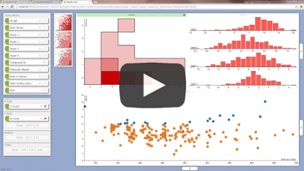
Powerful visualization that just works
Watch the Pipette Chart Intro Video
Easily Visualize Your Data
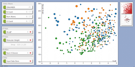
Visualize any data you have in the Pipette Workbench.
No steep learning curve or complex training needed.
Insights into your data are just a drag and drop away.
Visualize data straight from the Pipeline Pilot Professional Client.
Sharable Dashboards
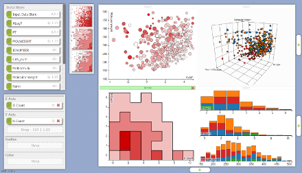
Have a service that can retrieve data? You are seconds from having a dashboard to visualize your data.
Easily add and configure multiple charts.
Apply filtering to all charts.
Quickly see data selections across different charts.
Sharing is as simple as emailing the url or posting it to your team site.
Obeys the Pipeline Pilot security settings for your data.
Designed to Work on Touch Devices
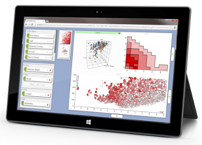
Easy to use on:
- iPad
- Windows 8 tablets and touch screen laptops
… but equally great to use with a PC and mouse.
Scatter Plots
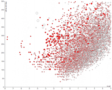
Easily plot two or more numeric properties.
Size points based on an additional numeric property.
Color the data based on series, an additional numeric property or a categorical property.
See the full details of any data point, including chemical structure.
Quickly switch between linear or log scales on each axis.
3D Scatter Plots
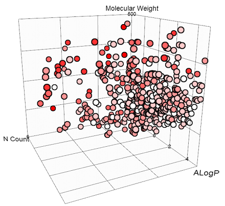
Interactive 3D visualization lets you better understand your data.
Color the data with an additional numeric property or a categorical property.
Available on WebGL enabled browsers.
Surface Charts
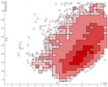
More insightful than scatter plots for extreme data volumes.
Visualize outliers as individual points and drill into their full details.
Histograms
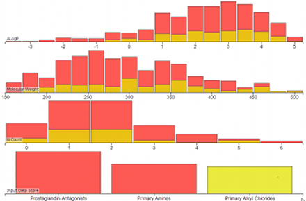
View distributions of numeric and categorical properties.
Cross-linking allows you to visualize the relationship between multiple properties.
Categorical Coloring
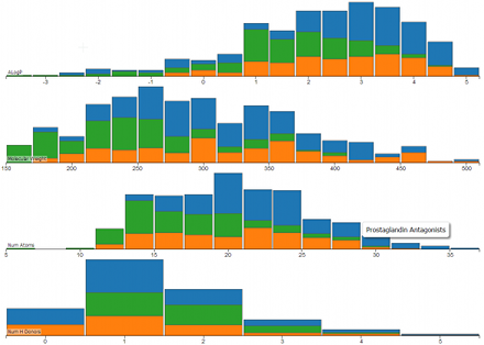
Color histograms, 2D scatter plots and 3D scatter plots using categorical properties.
Distinguish between the different data sources you used in the Pipette Workbench.
Correlation Matrices
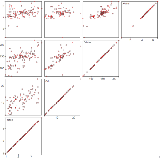
Quickly understand correlations between multiple properties.
Word Clouds
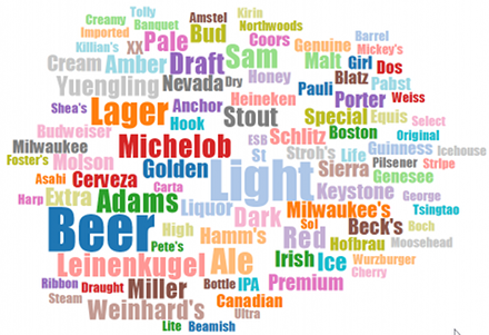
Visualize common terms in text or categorical properties.
Full Data Preview
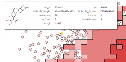
View full details, including structures or images, for individual points.
Seeing all of the information as it appears in the Workbench lets you understand your data faster.
Select Data Back to the Workbench
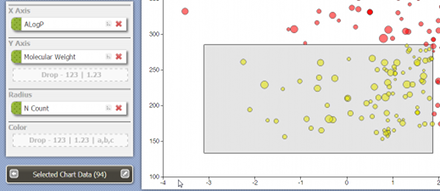
Grab selections from plots and exported it back to the Workbench.
Easily separate outliers for further investigation.
Visually filter your data before sending it into other applications.
Visualize Extreme Data Volumes
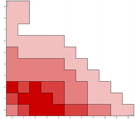
Seamlessly switches from aggregating data on the client-side to the server-side when your device reaches it data limits.
Charts showing aggregate data include histograms, surface charts (with or without outliers) and word clouds.
Able to handle data sets with millions of data points.
Filtering
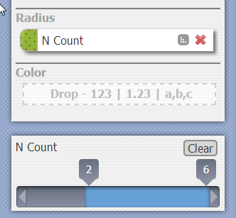
Quickly filter numeric property ranges so you can focus on the data of interest.
Filtered data is automatically reflected in all charts.
Want to try the Pipette Anaysis Charting on your Pipeline Pilot Server?
Contact us for more details.
